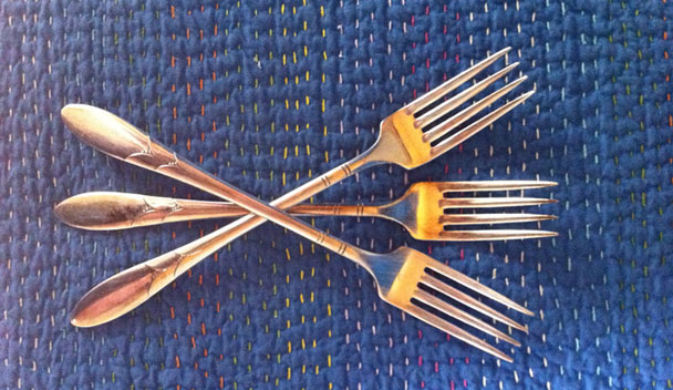
Have you ever fallen in love with a fork? I did, on a recent Friday at Brooklyn pie mecca Four & Twenty Blackbirds. The fork in question had four long, evenly spaced tines, a slim stem that rested lightly on my fingers, and a tapered end that came to a petal–like point. On the stem, more abstracted petals, with tiny berries or buds peeking out between them. It was feminine without being fussy, modern without being clunky, and very, very nice to eat (buttermilk chess) pie from.
So nice, in fact, that I wanted to take the fork home with me. I thought about putting it in my pocket— Four & Twenty Blackbirds is the sort of place that prides itself on mismatched everything, so they would never miss it—but then I would have served guilt with every meal. So I just turned it over and made a mental note of the brand on the back: Community.
We buy so many products for the kitchen with our eyes, from mixers to cutting boards, china to coffeemakers. My moment with the fork made me remember a basic principle of industrial design: how it feels. You wouldn’t buy a tool for the garden without first testing its weight, its grip, how easy it is to squeeze, and in truth, you shouldn’t buy something as simple as a fork without touching the merchandise and asking some questions.
In 1951, the Walker Art Center’s Everyday Art Quarterly devoted an entire issue to the history, use, and design of the knife, fork, and spoon, and the authors break it down like this: “The knife, fork, and spoon are HAND tools; they should fit in the HAND, work in the HAND, be comfortable in the HAND, balance in the HAND.” I hadn’t been thinking about any of this when I forked up that piece of pie, but this one stopped me mid–bite, it felt so right, so balanced between tines and handle. The EAQ continues, “The fork and spoon are used in the MOUTH; they should fit the MOUTH, carry proper quantities of food to the MOUTH, be comfortable to the MOUTH.” My fork’s four tines were long, straight along the edge to cut through the piecrust, pointy at the ends to spear pastry and custard. I knew I was holding a piece of good design. I had to find out more about it.
When I got home I tried various Google searches: community and flatware; community and pattern and silver. I discovered that Community was the first line of silver plate produced by Oneida Ltd., which was founded in 1880 and remains a well–known name in the tabletop industry today. But Community made tens of patterns and unlike some, my fork didn't have the pattern name stamped on the back. Many sites just list pattern names, or only have a few photos, but Copper Lamp, a store in Dallas, has an online visual dictionary of silverware. I scrolled the list, looking for my petals, and found them halfway down. My perfect fork was Lady Hamilton, 1932.
That it was from the 1930s made perfect sense. My previous favorite silver pattern, Stieff’s Betsy Patterson—my grandmother's choice for her wedding set;—was also issued in 1932 and has a lot in common with Lady Hamilton, notably that petal–like end. The year 1932 puts both patterns squarely in the Streamline era, when American design was moving toward modernism by stripping off historical detail and simplifying the outlines of everything from refrigerators to toasters to forks. My fork is a little longer and leaner than its historical predecessors, and that petal detail is transitional. Older flatware would have had actual flowers and shells on the handle. Community’s Paul Revere (1927) has a simple shape and a flat profile, but its handle is decorated with a pinprick design that looks like lace. The suggestion rather than the literal depiction of flowers is what made Lady Hamilton look new in the 1930s, while encouraging the newlywed that she wasn’t moving too far from her mother’s pattern.
Vintage Lady Hamilton ads tell the story of the pattern’s intended audience, and that audience’s perceived need for reassurance. “The happiest brides have Community,” reads one 1948 ad, showing a bride with a daisy headpiece. The tagline is, “If it’s Community…it’s correct!” A Christmas version includes a “handwritten” card, mentioning the company’s “famous good taste,” prices “in everybody’s reach,” and service for eight, in 1949, for “as low as $49.75.”
That’s the other thing about my perfect fork. It cost me under $2, less than the piece of pie. After I had identified the pattern, I went straight to eBay. Service for ten, in 2011, could be had for approximately $80. If Lady Hamilton had been a sterling–silver pattern it would have been significantly more expensive, and much heavier, but silver plate has the same warm cast as real silver. Compare that to the stainless steel offerings at Crate & Barrel, put on the registry by many a contemporary bride. (Grooms, too.) Prices range from $19.95 to $99.95 for one place setting, or five pieces. That means a minimum of $200 for the cheapest set. Flatware is one of the easiest things to buy used and online, because a maker’s pattern is instantly recognizable, and once you run the utensil through the dishwasher, it’s clean. (Silver in the dishwasher is heretical to some, but my grandmother swears it keeps it polished.)
Looking at Crate & Barrel’s offerings, you can also see how fashion–driven flatware is. Judging from the Community ads, Lady Hamilton was one of the plainest patterns on offer in the 1940s, but it seems wildly decorative today. The distinguishing characteristic of most contemporary patterns is silhouette. Square end or round, traditional flare or straight stem, bulbous or flat? I would trace C&B’s (and many of its competitors’) overall aesthetic back to Calvin Klein, who entered the home market in 1995 and made it more manly and more minimalist. The majority of the patterns are chunky, as if to indicate that this is the set for steak, not salad. If you want something with a little detail your choices are limited to faux bamboo, faux hammered (as if the pieces were handmade), or a fork fluted like a column. (I can’t imagine that feels good in the hand.)
 Pinterest